Unis... what coulda shoulda been

  • To unlock all of features of Rams On Demand please take a brief moment to register. Registering is not only quick and easy, it also allows you access to additional features such as live chat, private messaging, and a host of other apps exclusive to Rams On Demand.

XXXIVwin

Legend
Joined
Jun 1, 2015
Messages
5,373
ROD Credit 2025
224
OK, the new unis are out, I don’t hate ‘em and I don’t love ‘em. I’ll learn to like ‘em because I have no choice.

However... before completely giving in, I gotta re-post what the new unis SHOULD have been. Below is a link to a mock-up by a graphic designer named Chris Ramirez.

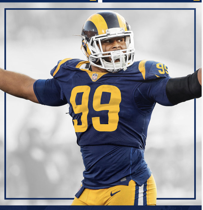
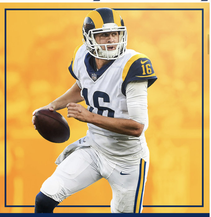
Ramirez made subtle tweaks to the classic unis so many of us know and love. Here are some photos:

Helmet:
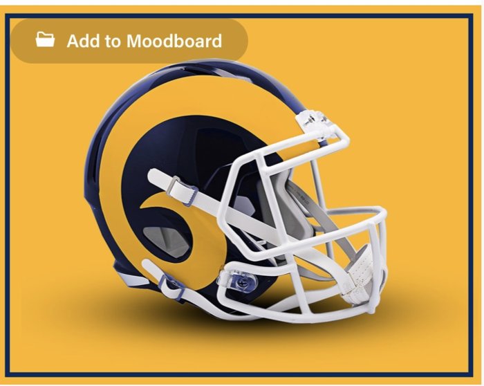
02F0DC93-0DF7-405F-B5CF-697B6D8FB310.jpeg

Home:
0B73CFC5-C9C0-46D9-853C-B1C9FFFD2132.jpeg

Away:
44AABFF6-5DC6-49F6-A439-35C3718D7D50.jpeg

Below is a link to his site, with the full details.

Rams look is iconic. Why mess with it? All he did was match the helmet color to the uni color, and a few minor tweaks.

No Autobots, no superhero pajamas, no “bone”, no segmented horn, no focus-group over-analyzed BS.

Just Perfection.

I’ll get with the damn program, I’ll force myself to like the new unis. I’m glad some people like them. I just want one last chance to complain about what coulda shoulda been.

Link:


Edit: Here’s another link, to some initial reactions to the Ramirez uni design.


View: https://www.reddit.com/r/LosAngelesRams/comments/es67ws/check_this_uniform_concept_out_very_in_depth_and/
 
Last edited:
Honestly, I hate the new uniforms. However, I think I'm now in the "bargaining" phase of the 5 stages of grief.

The bargain is I also disliked the St. Louis blue berries and yet I still followed the Rams so I guess I'll follow them now through this segmented-bright-blue-bone-gradient phase. I just can't stop following my team.

I personally was hoping for something similar to the above design --- some minor updates to bring a great classic uniform into the modern era. The thing that gets me is we went through incredible trials to get the league to let the Rams wear the classic blue/yellow throwbacks as the home uniform. Demoff did this he said because it's what the fans wanted. The Rams even wore these throwbacks in the recent Super Bowl. Then after all that effort they just chuck the classics aside.

I think if they just did some minor tweaking and updates to the classic uniform MOSTLY everyone would be satisfied. Why alienate a large segment of your fanbase?

And respects to people who like the new uniforms. This is just my humble opinion.
 
Last edited:
Nice uniform in the original post. Pretty much what i hoped for.

However, I'm pretty much over it now.
Not a big fan of the kit, it might grow on me.
Didn't like the St Louis change but ended up buying a home and away Faulk jersey.

Just ready for the season. Wear what you want to support the boys.
Looking forward to it.
 

Attachments

  • IMG_20200517_173803.jpg
    IMG_20200517_173803.jpg
    62.6 KB · Views: 65
  • Like
  • High Five
Reactions: ramfan46 and EasyE
I'm gonna go ahead and place myself into the minority. The uniform concept posted above is kinda boring. I personally love the new look (check out Akers in my avy!) But, love them or hate them, at least they're not the same old thing.
 
.

i like the new uniforms. they really pop out at you.

i won't be wearing them but they should look great on the football field on tv.

.
 
Last edited:
  • Like
Reactions: MadGoat
Like the uni above, but the new ones are growing on me. Even the bone uni's.

Didn't participate in the poll thread because I hated them at first but knew I would get used to them. I am. Actually beginning to like them now.

Respect to traditionalists, originally thought I was among you as far as the uni's are concerned. Onward!
 
These designs are fine, if not a little dull.

Genuinely don’t care for those darker tones at all, makes the entire thing look more boring. If they used the Rams current colors I’d like it more, it’s a classic look. Nice and safe, nothing wrong with it.
 
So the Ramirez guy basically put a white face mask on the helmet. That's the only difference I see on the home uni concept. The away looks like our current one, but in Cal colors. Well, color me unimpressed (cwutididthar?)

I think we all need to see the new gear on the feild. That is the only way to really judge these things IMO. I am also in the minority camp of people who think that bone uni is :fire:

The horns have been significantly changed. Many of us have an issue with the shortening of the horns. That is a major change.

Not talking about uniform style or colors or logos for mugs and T-shirts.
 
Perhaps it’s unreasonable to like everything. They are my Rams.... I may not buy everything I see, and that’s okay. Some I will.

Pros:
  • Colors POP. No confusion ITS THE RAMS among a sea of blacks and dark blues in the NFL
  • Helmets match
  • Fresh. Hoping they look cool on the field.
  • Did I say I love the colors? lol. Lots of cool stuff can be made with these in combination. Just bought a royal coloured knit hat that looks sharp.
Cons:
  • Gradient. Not too late to drop this, please
  • Segmented horn, horn changes in general
  • Font, logos, too artsy for my taste
I am beginning to think redesigns are going to be a regular thing in the NFL. We already have two “announced variations” planned in the seasons ahead.

So, if you don’t like everything...changes will be offered.

This is the way I see it.

Rams are like the Rangers. We lead the way. (Yeah, that's a bit of shameless self promotion).

We do things first.

First professional team to move to Los Angeles? Rams. First team to have integration? Rams. First team to put a logo on the helmet? Rams. First team to have all their home and away games on TV? Rams.

First team to move the NFL into a new era of jerseys?

Rams.
 
To the OP, that blue is too dark for my liking. While I don't mind the new Blue, I think the perfect for me would be somewhere in between.
 
Those are very good looking uniforms, but they're not that much different from what we already had tbh. I'm honestly more excited to see these new uniforms pop on the tv screen, even if they might take some getting used to
 
  • Like
Reactions: shovelpass